Donnerstag, 29. April 2010
Mittwoch, 28. April 2010
"Irgendwas mit Social Media"
Das erste Drittel dieses Jahres ist vorbei und es lässt sich sagen, dass Social Media in der Unternehmenskommunikation angekommen ist. Alles webzwonullige läuft auf heavy rotation in einschlägigen Fachpublikationen wie Horizont oder WUV. Dem kann sich kein Marketeer und kein Kommunikator mehr entziehen. So langsam springen alle auf den Zug auf, wollen ihre Facebook-Seite, den Twitter-Account und ein hübsches YouTube-Video. Die Rede ist nicht von den Innovatoren aus E-Commerce und ITK, den großen Lifestyle-Marken oder Verlagsprodukten. Vielmehr sind es jetzt Mittelständler und mausgraue B2B-Unternehmen, die bei den Agenturen anklopfen und sich Rat holen.
Guter Artikel über eine Zukunft von Social Media: In 5 Jahren spricht niemand mehr über Social Media, sondern über Fachkräftemangel | Cluetrain PR
Dienstag, 27. April 2010
Information Design Patterns
Information Design Patterns: "This website is part of the Master's thesis The Form of Facts and Figures, developed by Christian Behrens in the Interface Design program at Potsdam University of Applied Sciences. Its goal is the development of a design pattern taxonomy for the field of data visualization and information design."
WePad Interface Demo
Sorry, best off:
- Die Software ist am Starten
- Die Applikation sind wirklich am Laufen alle
- Wir haben nicht nur eine Navigation auf der rechten Seite - sondern wir haben auch eine Navigation auf der linken Seite. (Wow)
- Ich kann hier auf einen Knopf drücken
- Querformat ist besser als Hochformat?
- Wir sind ja nicht so wie Apple
- Ah doch es kommt
- Das ist eher, das Otto so langsam ist
Besser kann man die Unterschiede zwischen Apple und WePad nicht aufzeigen. Bottom Up vs. Top Down.
Mehr dazu bei auch bei Gerrit.
Read Article: WePad Interface Demo & Hands-on mit dem (fast) finalen Gerät
Montag, 26. April 2010
Social Media im Unternehmen: Die zwölf häufigsten Fehler
1. Me too
2. Keine klar definierten Zuständigkeiten
3. Abwarten
4. Social Media als verlängerter Arm der Werbeabteilung
5. Überadministration
6. Unterschätzung des Aufwands
7. Unterschätzung juristischer Probleme
8. Mit Kanonen auf Spatzen schießen
9. Monolog statt Dialog
10. Keine Transparenz
11. Zu hohe Erwartungen
12. Angst vor Fehlern
Read all at Social Media im Unternehmen
Freitag, 23. April 2010
User Experience Patterns
- Welie.com - Patterns in Interaction Design
- Quince UX Design Patterns Explorer
- Yahoo! Design Pattern Library
- UI-patterns.com
Read full article: Aaron Hursman: User Experience Patterns
- Quince UX Design Patterns Explorer
- Yahoo! Design Pattern Library
- UI-patterns.com
Read full article: Aaron Hursman: User Experience Patterns
Donnerstag, 22. April 2010


Future Concept Designs
Example: "Using the wearable Dew camera, users can constantly record daily experiences. The camera has emotional recognition through vocal rhythms and gesture recognition through hand motionsThe camera achieves emotional recognition by analyzing vocal rhythms and gesture recognition by analyzing hand movements. A server saves your viewed scenes in real time through the network. And the Dew viewer reproduces your memories, which can be saved through emotional and gesture recognition. You can also enjoy looking at the images of yourself that have been taken by a Dew camera worn by someone else. The images of yourself are automatically searched through other people’s visual data shared on the network. Designer: NEC and SGI Japan Ltd."
Future Concept Designs - Dew Life-Recording Interface - Slideshow from PC Magazine
Touch Gesture Diagrams

Various sets of gestural icons, omnigraffle stencils sets and interaction posters can be found at: LukeW | Touch Gesture Diagrams
Mittwoch, 21. April 2010
Next Level Conference
Am 20./21. April 2010 veranstaltet das NRW KULTURsekretariat in Verbindung mit der Landesregierung Nordrhein-Westfalen eine Konferenz, die zugleich Festival ist. Die international aufstrebende Games-Metropole Köln bietet dafür mit den AbenteuerHallenKALK die geeignete Location.
"Next Level" öffnet Gamern und Kulturschaffenden, aber auch Kulturpolitikern und Pädagogen ein weites Spielfeld: In vier korrespondierenden Panels mit Vorträgen und Live Acts diskutieren und praktizieren Künstler, Kreative und Kulturvermittler die verschiedenen kulturellen Spielformen und vielfältigen künstlerischen Ausprägungen der digitalen Spiele.
Next Level Conference
Comparing E-Readers
How Do E-Readers Stack Up With iPad In The Mix?
- iPad
- Kindle 2
- Kindle DX
- Nook
- Reader Daily Edition
- Que
Comparing E-Readers
- iPad
- Kindle 2
- Kindle DX
- Nook
- Reader Daily Edition
- Que
Comparing E-Readers
Axure
Axure RP is the leading tool for rapidly creating wireframes, prototypes and specifications for applications and web sites. Quickly get the benefits of prototyping without a lot of hassle.
Axure - Wireframes, Prototypes, Specifications
Axure - Wireframes, Prototypes, Specifications
Ohm Studio
Ohm Studio is a standalone real-time collaborative music making application (DAW/sequencer) in addition to a web based collaboration platform and a music driven online cohmunity.
Nowadays music tools are powerful and have great features, but you may have already dreamed about this one in particular: real-time collaboration. Wouldn't it be cool being able to work with your friends while sharing the same tools at the same time, as if you were together in a studio? The Ohm Studio is the answer and even goes one step beyond: interface innovation, integrated web cohmunity, server based projects, undo/versioning and much more. From this day forward, the meaning of online music collaboration is being redefined.
Ohm Studio | Together sounds better.
Dienstag, 20. April 2010
see #5 review: Hannes Koch, rAndom International
London-based art and design collective rAndom International was founded in 2002 by Hannes Koch, Stuart Wood and Flo Ortkrass. rAndom International have developed a series of artistic projects and installations that aim to re-interpret the “cold” nature of digital-based work by providing the viewer with the opportunity to have a more hands-on experience with technology. More recently, their work has investigated the potential of adding behavioural qualities to usually in-animate objects and environments. Apart from experimental works rAndom realizes commissioned works for clients such as Philips, Fiat and Nokia.
Examples:
Further Projects:
As part of the Honda F1 Drivers day for Rubens Barachello, rAndom international were invited to develop a site specific work to celebrate the end of an era of F1. The result was a 7x3m phosphorescent race track, the only F1 race track in Buenos Aires, albeit suited for miniture 1:24 scale F1 Radio controlled cars. The cars were custom fitted with UV diodes which left the racing line illuminating in the dark.
http://random-international.squarespace.com/buenos-aires-race-track-honda/
Resources:
http://www.pixelsumo.com/
What does it mean to be a pixel?- www.random-international.com
Examples:
Sticky - Instant labeling tape
Was designed as a simple, customisable, do-it-yourself signage system. By "blacking out" elements of a 14-segment display font on the tape, all you need is a black permanent pen to create your own temporary signs, labels and installations. Think re-naming your street after your loved one, moving house and labelling boxes, putting up official-looking signs or teaching your kids how to make letters...rolls are 65 metres.
PixelRoller
PixelRoller is a paint roller that paints pixels, designed as a rapid response printing tool specifically to print digital information such as imagery or text onto a great range of surfaces. The content is applied in continuous strokes by the user. PixelRoller can be seen as a handheld “printer”, based around the ergonomics of a paintroller, that lets you create the images by your own hand.
Temporary Graffiti Light Cans
The cans were originally commissioned by and developed for the Nokia Leave No Trace tour in 2005 / 2006. Based around the ‘contemporary’ graffiti capabilities of the LightRoller, we wanted to make part of the experience more accessible to the audience; following the success of the light pens that were part of the first presentation of the LightRoller, we further explored the ergonomics of the classic graffiti tool: the spray can. After some refinements,the aircraft grade aluminium cans look and feel like their analogue counterparts, just that they are working with nothing but light.Temporary Graffiti: rAndom vs 3TTman and from rAndom International on Vimeo.
Temporary Printing Machine at KineticaTemporary Printing Machine Limited Edition from rAndom International on Vimeo.
Swarm Light ChandelierSWARM Light Chandelier from rAndom International on Vimeo.
Fade to light installation
An awareness of the kinästhetic power of mirrors and light is the dominant characteristic that has been developed by the interactive art work ‘You Fade To Light’. It engages directly with aesthetic ideas of kinästhetic learning by actual physical involvement. But by learning it is not suggested that the work is in any way didactic, since most creative learning in life is developed through participating in play.You Fade To Light / edit 1 from rAndom International on Vimeo.
http://www.random-international.com/you-fade-to-light-milan-2009/
Audience. Installation
In February 2010, rAndom went to the US to install the first copy of the Audience edition for a private collection. The installation is laid out on a long stretch of a custom designed plywood floor. For the first time it was possible to install it in a way that the mirrors are creating an autonomous play of light patterns on the wall.Audience February 2010 - Unedited from rAndom International on Vimeo.
http://www.random-international.com/audience-private-collection/

Further Projects:
As part of the Honda F1 Drivers day for Rubens Barachello, rAndom international were invited to develop a site specific work to celebrate the end of an era of F1. The result was a 7x3m phosphorescent race track, the only F1 race track in Buenos Aires, albeit suited for miniture 1:24 scale F1 Radio controlled cars. The cars were custom fitted with UV diodes which left the racing line illuminating in the dark.
http://random-international.squarespace.com/buenos-aires-race-track-honda/
Resources:
http://www.pixelsumo.com/
Twitter Revisit Visualisation
Very nice real-time visualization during the see-conference #5:
moritz.stefaner.eu - revisit - demo
"Revisit is a real-time visualization of the latest twitter messages (tweets) around a specific topic. Use it create your own twitter wall at a conference or an ambient display at your company or whatever other idea you come up with. In contrast to other twitterwalls, it provides a sense of the temporal dynamics in the twitter stream, and emphasizes the conversational threads established by retweets and @replies."

moritz.stefaner.eu - revisit - demo
see #5 review: Kent Demaine, OOOii
For the past fourteen years, OOOii has specialized in information visualization and future technology design for the Hollywood movie industry. They work for films like Minority Report, Star Trek, Mr. and Mrs. Smith, and The Island. And with technologies such as multitouch surfaces, gesture based interaction, real-time installations, augmented reality and game engines. Creative Director Kent Demaine began his career in the camera department as Cinematographer and photographer. He is an award winning VFX supervisor for commercial clients such as Apple, Porsche, Mini Cooper, and Sony, and he has designed award winning main title sequences including the currently airing CSI:NY. Kent participated in think tanks for the CIA and Microsoft Research. Prior to the film industry, he worked for Accenture as a Sr. Consultant responsible for large information systems design/implementation for clients such as Pacific Bell and the US Department of Defense.
OOOii | Designers of the Live Environment
Examples:
OOOii | Designers of the Live Environment
Examples:
Minority Report
Star Trek
see #5 review: Nicolas Felton
Graphic designer Nicholas Felton is obsessed with data. He knows how many songs hes listened to and how much it costs him per mile to fly. Felton visualizes these numerous details in personal Annual Reports. At PopTech 2009, Felton examines what a weeklong-snapshot of New York Times front pages reveals about America.
Nicholas Felton | Feltron.com, Nummerical narratives.
Examples:
How many miles did i travel per
- Flight
- Feet
- Bike
Sensors
- Nike iPod Sport Kid
- Odometer
- Fitbit
Which music did i listen to?
- Last FM
- Twistory
- Mut (?)
Further:
- Which streets did i walk?
- Which brands did i use?
- First everything (of flight canceld due to a vulcano)
- Bills, Taxes
- Routines (Pills etc.)
Inspiration: Edward Tufte
Personal daily statictic services:
Daytum.com tracks everything, you want:
Whether you would like to tally an afternoon or a year, Daytum can help you collect and communicate the most important statistics in your life. From an up-to-the-moment personal dashboard, to a tabulation of an event, a home for sports scores, or as a corporate tool, the uses for Daytum may be limitless.
Daytum is free to use for as long as you like, but we also offer a Daytum Plus account for $4/month that offers additional features including the ability to collect and present more data, create pages and apply privacy settings to your account.
Designers motivation: Stories to tell.
Example: http://daytum.com/AndreasT
Nicolas Felton was inspired by the book Catch-22

IDEO Method Card iPhone Application
 The Method Card app is released as a free download with 8 cards for you to experience on your iPhone or iTouch. You can purchase the full deck of 51 cards for $4.99 within the application, eliminating the step of having to leave the app to upgrade your experience.
IDEO Method Card iPhone Application - Articles - News - IDEO
PDF-Download of Cards:
http://humanoid.bplaced.net/ideo-method-cards.pdf
Augmented Reality Business Conferece
Speakers:
Herbert Bay, kooaba
David Blumberg, Blumberg Capital
Matthew Buckland, 20fourlabs, Creative Spark
Russell Buckley, AdMob, MMA
David Caabeiro, Sequence Point Software
Max Celko, Strange Matter, Peep Insights
Mihai Corlan, Adobe
Chetan Damani, acrossair
Martin Duval, bluenove
Dave Elchoness, Iryss
Eric Gehl, Total Immersion
Daniel Gelder, Metaio
Dr. Michael Klein, INM Institute for New Media
Johannes Koblenz, Fjord
Laurenz Lenkewitz, Hiwave
Mark Miller, CatCap
Robert Rice, AR Consortium
Gabriel Shalom, KS12
Matthew Szymczyk, Zugara
Markus Tripp, Mobilizy
Prof. Frans Vogelaar, Hybrid Space Lab
Pia Vuohelainen, NAVTEQ
Prof. Roland M. Wagner, BHT Berlin
Michael Zoellner, Fraunhofer
1St European AR Buisiness Conference
Berlin, April 23, 2010
Conference Location
Ludwig Erhard Haus Berlin
Fasanenstraße 85
10623 Berlin
ARBcon.eu - 1st European AR Business Conference
Montag, 19. April 2010
see #5 review: Andrew vande Moere, information aesthetics
Andrew Vande Moere is a senior lecturer affiliated with KULeuven, Belgium, and the University of Sydney, Australia. His research interests include data visualization, interaction design, media architecture and physical computing. Andrew is also the sole author of the "information aesthetics" weblog, a website collecting compelling representations of information that are engaging as well as insightful.
information aesthetics - Information Visualization & Visual Communication
Look at: http://www.benfry.com/
Review of speech:
Al Gore, climatic change (watch 8:55 h)
Web2DNA
Grafic web2dna.png
WEB2DNA will take you website, analyze it, crunch it to little bits and spit it out as a graphic representation of a human DNA.
The brightness of the lines is determined by the importance of the tags in terms of structure.
- H1 is brighter than H2, which is brighter than H3.
- TABLE is brighter than TR, which is brighter than TD tags.
- Images and flash elements appear as 70% white.
- New HTML tags like STRONG and EM is brighter than older ones like B and I
- UL, OL and DL is brighter than their LI, DT, DD
- DIV layout is brighter than table layout
http://www.baekdal.com/web2dna/
Visualisation: Rice population demographics
1 corn of rice = 1 victim of war
a physical visualization of the world population demographics, by mapping 1 grain of rice to represent 1 human being. in the "of all the people in all the world" installation, population statistics are separated out in different piles to juxtapose compelling social phenomena, such as the comparison of all the prisoners in the world versus all the people in gated communities (roughly equal).
Installation: news casualties as candy
An art installation that represent the casualties in news reports as an ever-increasing random constellation of bright yellow candy. a computer program continuously scans the headlines of 4,500 English-language news sources around the world, looking for people who have been reported killed. the algorithm determines the number of deaths, & instructs a specially designed ceiling-mounted mechanism built with Lego NXT parts to drop one yellow BB per person. as a result, BBs will accumulate on the floor, ultimately forming a sort of aesthetic monument.
http://caleblarsen.com
Make data visible: power-aware cord
Bild: http://infosthetics.com/archives/powerawarecord.jpg
An electrical cord that acts as an ambient display, as the amount of energy is displayed through dynamic glowing patterns produced by electroluminescent wires molded into its transparent shell. this cord attempts to increase consumer awareness regarding energy consumption, by a new intuitive way of representing energy in domestic, electric products. also see dangling string. [tii.se]
Twitter Earings? Image?
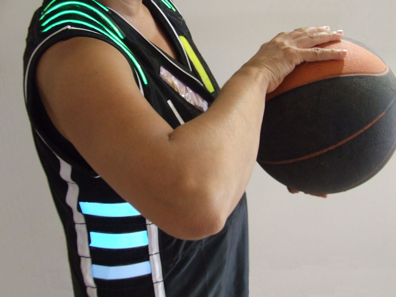
Data visual sports jersey:
we recently designed & implemented a set of 4 electronically-enhanced basketball jerseys with different EL-panels that light up according to game-related data, such as fouls, score, time clock, etc. the jerseys are wirelessly controlled from a central computer by a game official in real time.
the TeamAwear system aims to actively enhance the awareness & understanding of the actual team sport situation for its different stakeholders, including athletes, referees, coaches & spectators.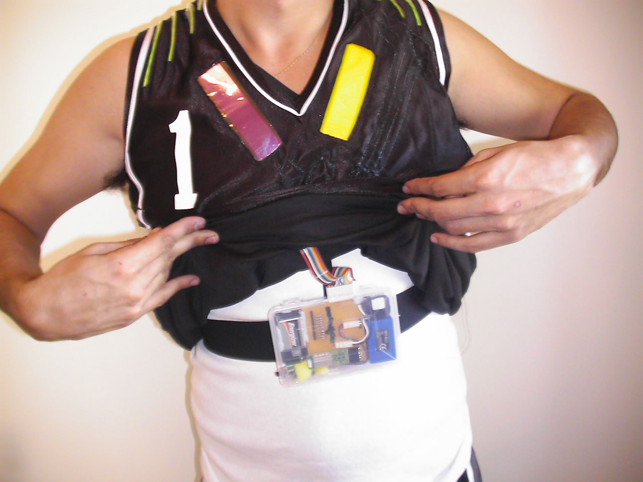
Links:
- http://www.mitchellpage.com.au/teamawear/index.html
- http://www.smh.com.au/news/technology/technology-gets-a-guernsey/2006/11/20/1163871338586.html?page=fullpage#contentSwap1
- http://wwwfaculty.arch.usyd.edu.au/kcdc/
An impressive online sharing project, developed by the renown IBM Visual Communication Lab, to encourage sharing & conversation around visualizations. the goal of "Many Eyes", which is still in 'alpha phase', is to "democratize visualization, enabling anyone on the Internet to publish powerful interactive visualizations & start their own data conversations."
http://manyeyes.alphaworks.ibm.com/manyeyes/
City-scale energy consumptionFirst 30 seconds of Green Cloud goes online from HeHe on Vimeo.
An intriguing eco-visualization concept, originally blogged in April 2005, recently seems to have become reality. "Nuage Vert" ("Green Cloud") is a city-scale light installation representing the actual energy consumption (& its accompanying environmental pollution?) of a coal burning power plant.
More: http://www.pixelache.ac/nuage-blog/
Sensing City Amsterdam, Persuasive Data Visualisation
A city has its own rhythm that affects the life of its people and is at the same time created by them. Bus schedules, traffic lights and the turn signals of cars are familiar patterns to the citizen. This interplay between creation and inspiration is also at the heart of all music. Making music means translating impression into sound, listening to music means transforming sound into impression.
So what happens if we allow these urban rhythms to occasionally have a direct influence on the musical performance of an eleven-piece-ensemble?
As the movement of cars outside the concert venue triggers the rhythms that are being played, the urban dwellers not knowingly become part of the composition, the city becomes audible through the musicians. This process happens in real-time and is guided by the framework of a video-installation that surrounds the ensemble during the performance of sensing city.Sensing City Preview from LevenMusterCollective on Vimeo.
#Sonification

see #5 Review: Dieter Brell, 3deluxe
Wir wollen die Zeit der Menschen gestaltenDieter Brell, 3deluxe :: Transdisciplinary Design
Projects:
Kinder und Jugendpavillion "Scape" auf der Expo 1998
Leonardo Glass Cube
(Die Kommentare ;-)
VW Autostadt Atmosphere auf der IAA
Pavillon Cyberhelvetia auf der EXPO 02
In Anlehnung an eine traditionelle Schweizer Badeanstalt wurde der 'Cyberhelvetia'-Pavillon auf der Expo.02 in Biel als Ort der persönlichen Begegnung und Kommunikation konzipiert. Kommunikation kann heutzutage auf vielfältige Art und Weise stattfinden, unabhängig von Ort und Sprache. Auch ein gemeinsames Bad benötigt kein reales Wasser mehr: Ein blau leuchtender Glasquader ersetzte das reale Schwimmbecken – die Ausstellungsbesucher tauchten kopfüber in die vielschichtige Atmosphäre einer virtuell erweiterten Wirklichkeit und badeten in Licht und Klang.
Film: http://www.3deluxe.de/projekte --> Film
Football Globe Germany
3deluxe gestaltete den Innenraum des fußballförmigen Pavillons zu einem poetischen Informationswandler, der mittels einer interaktiven 360°-Projektion die augenblickliche Fußballbegeisterung der Ausstellungsbesucher vor Ort und von Menschen aus aller Welt widerspiegelte. Diese 40m lange Collage aus bewegten Bildern, grafischen und textlichen Elementen wurde durch die Einbeziehung des Publikums zu einem Meilenstein der Ausstellungskultur.Interaktive Spielinstallationen ließen die Teilnehmer in unterschiedliche Rollen aus der Welt des Fußballs schlüpfen oder informierten sie über vergangene und zukünftige Weltmeisterschaften.
(Made with vvv)
Cocoon Club, Frankfurt, Corporate Design
Der CocoonClub wurde als avantgardistisches Experimentierfeld für die Transformation von Raum und Wahrnehmung konzipiert. In einem interdisziplinären Prozess gestaltete 3deluxe alle Elemente zu einem ganzheitlichen Raum, in dem sich Architektur, grafisches Programm sowie Medien- und Webdesign wechselseitig beeinflussen. Die perforierten Wandflächen des triangulären Hauptraumes erinnern an eine permeable Zellmembran, durch deren Öffnungen der Besucherfluss stattfindet. Sie ist wegen ihres mehrschichtigen Aufbaus und ihrer Oberflächenstruktur das signifikanteste architektonische Element des Clubs. Sie wird mit einer bewegten 360°-Projektion bespielt, die in Echtzeit mit dem DJ-Set abgestimmt werden kann.
see #5 Review: Gideon Obarzanek, Chunky moves
Gideon Obarzanek from http://www.chunkymove.com/.
Founded in Australia by choreographer Gideon Obarzanek, his company Chunky Move has earned an enviable reputation for producing a distinct yet unpredictable brand of genre-defying dance performance. Obarzanek’s works have been diverse in form and content and include stage productions, installations, site-specific works and film. His multi-award winning works have been performed in many festivals and theatres around the world in the U.K, Europe, Asia and the Americas."
Chunky moves was inspirated by the book "Painting by Numbers",
#Dancing Agent States.
Winscape
Winscape
You can do this on your existing HD TV!
If you have a Mac attached to your HD TV, you can easily run the Winscape software with one or more of our scenery movies. The Winscape software is free to try and it works on any movie in your Movies folder. We are planning to have a Wii Remote and much sleeker IR necklace kit available by July. If you are interested, please send us an email so that we can keep you in mind as the plans are finalized. If you want to do your own custom install, keep reading for tips and information.
Freitag, 16. April 2010
Flash for iPhone mit Skyfire
Skyfire ist ein Browser für Smartphones welcher, wie auch der Opera Mini, auf eine Gecko Rendering Engine basiert und Webseiten zuerst serverseitig komprimiert bevor sie auf den Browser des Users gesendet werden. Dies trifft auch auf Flash-, Silverlight- und Quicktime-Inhalte zu, die ohne zusätzliche Plugins am Smartphone selbst, im Browser wiedergegeben werden können.
Skyfire: Mobiler Browser mit integriertem Flash auf App Store Kurs | BENM.AT
Agent States for Windows

The Microsoft Agent animation services automatically play certain animations for you. For example, when you use MoveTo or GestureAt commands, the animation services play an appropriate animation. Similarly, after the idle time out, the services automatically play animations. To support these states, you can define appropriate animations and then assign them to the states. You can still play any animation you define directly using the Play method, even if you assign it to a state.
Agent States (Windows)
Src: http://blogs.msdn.com/nativeconcurrency/default.aspx?p=2
Donnerstag, 15. April 2010
UX Evangelists
1.
Bill Scott
b.scott@yahoo.com
http://twitter.com/billwscott
Description:
Bill Scott is director of UI Engineering at Netflix in Los Gatos, CA, where he plies his interface engineering and design skills. Scott is the former Yahoo! Ajax evangelist and pattern curator for the Yahoo! Design Pattern Library.
He has a long and glamorous history in the IT world, due mostly to his unique understanding of both the technical and creative aspects of designing usable products. His ramblings and musings can be found at www.looksgoodworkswell.com.
Publications:
Designing Web Interfaces, Principles and Patterns for Rich Interactions, O'Reilly
Video:
http://video.yahoo.com/watch/1285664/4515808
2.
Jesse James Garrett, Adaptive Path
http://blog.jjg.net/
http://en.wikipedia.org/wiki/Jesse_James_Garrett
Description:
Jesse James Garrett is a user experience designer whose work in rich, real-time Web software systems essentially led to the development of new paradigm in online interactivity known as AJAX. James' seminal, early-2005 paper on the subject has been widely cited and extended by information technologists to create new models of information presentation on the Web, such as Google Maps.[1]
Jesse James Garrett is a co-founder of Adaptive Path, a user experience strategy and design firm, and co-founded the Information Architecture Institute. His essays have appeared in New Architect[3], Boxes and Arrows[4], and Digital Web Magazine[5]. Jesse attended the University of Florida.
Publications:
The Elements of User Experience, User-Centered Design for the Web
Video:
http://vimeo.com/6952223
http://blog.discuss-discover.com/2009/10/video-interview-mit-jesse-james-garrett/
3.
Peter Morville
http://semanticstudios.com/
Description:
Semantic Studios is an information architecture and user experience consulting firm led by Peter Morville. We help our clients around the world to create better web sites, intranets, and interactive products and services.
Publications:
Search Patterns, O'Reilly
Ambient Findability: What We Find Changes Who We Become (Paperback),O'Reilly
Information Architecture for the World Wide Web: Designing Large-Scale Web Sites (Paperback),
Upcoming Presentations:
Keynote. Enterprise Search Summit
New York, New York. May 12, 2010
IA with Maps. UX London
London, England. May 20, 2010
Video:
http://www.youtube.com/watch?v=rXOv8HJa1MY
4.
Jared Spools
http://www.uie.com/
Description:
User Interface Engineering is a leading research, training, and consulting firm specializing in web site and product usability. Jared M. Spool and his team of researchers oversee a variety of events and publications.
Publications:
Our UIE Virtual Seminars allow you to learn from the comfort of your own office.
In 2010, we added a brand new event, the UIE Web App Masters Tour. A two-day event focusing on web-based applications happening in four different citites.
The User Interface Conference, November 8-10, 2010, in Boston, is a three-day event covering the biggest issues in the world of design.
Video:
http://interactiondesign.sva.edu/blog/entry/video_jared_spool_what_makes_design_intuitive/
5.
Christian Crumlish
http://twitter.com/mediajunkie
Oakland, California
Description:
Christian Crumlish is the curator of the Yahoo! Design Pattern Library and has been designing and writing about online user experiences since 1994. He is a director of the Information Architecture Institute, a member of the Open Web Foundation, and co-chair of the monthly BayCHI program.
He is the author of The Power of Many and co-author of Designing Social Interfaces with Erin Malone. He studied philosophy at Princeton and painting at the San Francisco School of Art, and lives in Oakland, California, with his wife, Briggs, and his cat, Fraidy.
Publications:
Designing Social Interfaces
Principles, Patterns, and Practices for Improving the User Experience, O'Reilly
Video:
http://igniteshow.com/videos/christian-crumlish-designing-play
6.
Stephen P. Anderson
http://www.poetpainter.com/
Description:
Stephen P. Anderson is a product strategy and design consultant who helps large companies create valuable customer experiences.
Prior to becoming an independent consultant, Stephen spent more than a decade growing and leading teams of information architects, interaction designers and UI developers in the creation of all types of interactive experiences, bringing value to clients such as Nokia, Frito-Lay, Sabre Travel Network, and Chesapeake Energy as well as smaller technology startups.
Stephen is passionate about elegant design, remarkable customer experiences and managing maverick teams– topics he loves to write and speak about. In addition to consulting, he is in the process of doing research for a book that will teach businesses how to attract and manage rockstars, superheroes and other misfits.
Publications:
http://www.poetpainter.com/speaking/
http://www.poetpainter.com/consulting/
Video:
http://mxconference.com/videos/video-of-stephen-anderson-at-mx
7.
Louis Rosenfeld
http://louisrosenfeld.com/home/
Description:
Lou Rosenfeld is an independent information architecture consultant, and founder and publisher of Rosenfeld Media, a publishing house focused on user experience books. He has been instrumental in helping establish the fields of information architecture and user experience, and in articulating the role and value of librarianship within those fields.
http://louisrosenfeld.com/biography/
Publications:
http://louisrosenfeld.com/publications/
http://www.rosenfeldmedia.com/products/
Video:
http://video.google.com/videoplay?docid=-7454504685193710603#
8.
Luke Wroblewski
http://www.lukew.com/
Description:
Luke is currently Chief Design Architect at Yahoo! Inc. where he works on product alignment and forward-looking integrated customer experiences on the Web, mobile, TV, and beyond.
Publications:
Web Form Design, FILLING IN THE BLANKS, By Luke Wroblewski. Rosenfeld Media, May 2008.
http://vimeo.com/4420806
Video:
http://www.lukew.com/ff/entry.asp?794
9.
Eric Reiss
http://www.ux-lx.com/ericr.html
Description:
Eric Reiss is the author of Practical Information Architecture (ISBN 0-201-72590-8) and Web Dogma '06. He has emerged as one of the most influential figures on the European information architecture/usability scene. In recent years, Reiss has also been an outspoken critic of innovationists who do not differentiate between innovation and invention. Reiss argues that innovation is a later stage than invention and that it is always a planned activity and never accidental.
Publications:
http://en.wikipedia.org/wiki/Eric_Reiss
Video:
http://www.youtube.com/watch?v=GiObQxRUX3s
10.
Bruce Mau
http://www.brucemaudesign.com/
Description:
Bruce Mau is a visionary and world-leading innovator. As Chief Creative Officer of Bruce Mau Design, he proves that the power of design is boundless, and has the capacity to bring positive change on a global scale.
Mau founded his studio in 1985, and his first project was the celebrated Zone Books series. A decade later he produced S,M,L,XL, an award-winning compendium developed in close collaboration with Rem Koolhaas. In 2003 Mau founded the Institute without Boundaries, a studio-based postgraduate program that was formed out of the conviction that the future demands a new breed of designer. This became the engine for Massive Change, an ambitious travelling exhibition, publication and educational program series that mapped out the power and possibility of design. In recent years he also worked on !Guateamala!, in collaboration with business and cultural leaders of Guatemala, to design a galvanizing movement to realize a positive future of their country.
Publications:
http://en.wikipedia.org/wiki/Bruce_Mau#References
Video:
http://www.youtube.com/watch?v=vrfUBr1impQ
11.
Matthias Müller-Prove
User Experience & Interaction Design
http://www.mprove.de/
Description:
Matthias Müller-Prove, Dipl.-Inform, verfügt über langjährige Berufserfahrung im Bereich Human-Computer-Interaction bei international operierenden Software-Firmen. Er hat maßgeblich die Benutzungsschnittstelle von Adobe GoLive gestaltet und arbeitet derzeit im User Experience Team von StarOffice für Sun Microsystems. Er ist Mitglied der ACM/SIGCHI und der Usability Professionals' Association UPA.
Events:
12. April User Experience Roundtable Hamburg
20. April [HIForum] Arno Rolf über Informatik und Gesellschaft
8. Mai artop Kamingespräch, Berlin
27. Mai TEDxHamburg
Publications:
http://de.sevenload.com/videos/k3nmH0E-Matthias-Mueller-Prove-Erfolgsfaktor-Informationsarchitektur-ein-Ueberblick-ueber-Konzepte-und-Methoden
12.
Donald Norman
http://www.jnd.org/
Description:
Donald A. Norman (* 25. Dezember 1935) ist emeritierter Professor für Kognitionswissenschaften der University of California, San Diego und Professor für Informatik an der Northwestern University. Er gilt als Usability-Spezialist und ist zusammen mit Jakob Nielsen und Bruce „Tog“ Tognazzini Gründer der Firma Nielsen Norman Group, die sich hauptsächlich im Bereich Usability-Beratung betätigt.
Publications:
http://www.jnd.org/books.html#608
Video:
http://www.ted.com/talks/don_norman_on_design_and_emotion.html
13.
Indi Young
http://www.adaptivepath.com/aboutus/indi.php
http://www.indiyoung.com/
indi@acm.org
Description:
Indi is an applications and navigation guru who began her work in Web applications in 1995. Her clients range from technology start-ups to large financial institutions. Projects include global corporate intranets, consumer finance and investment tools, enterprise software lead generation sites, knowledge management tools, workflow applications, and business-to-business e-commerce.
Publications:
Mental Models ALIGNING DESIGN STRATEGY WITH HUMAN BEHAVIOR
By Indi Young. Rosenfeld Media, February 2008.
Video:
http://www.youtube.com/watch?v=M4AsxNg9nNU
Sonstige:
http://www.ux-lx.com/speakers.html
http://www.adaptivepath.com/aboutus/appearances/
User Experience Blog
UX-Blog mit einigen Bekannten von der Nexum Ag:
uxzentrisch – User Experience Blog
uxzentrisch – User Experience Blog
THE JOHNNY CASH PROJECT
The Johnny Cash Project is a global collective art project, and we would love for you to participate. Through this website, we invite you to share your vision of Johnny Cash, as he lives on in your mind’s eye. Working with a single image as a template, and using a custom drawing tool, you’ll create a unique and personal portrait of Johnny. Your work will then be combined with art from participants around the world, and integrated into a collective whole: a music video for "Ain’t No Grave", rising from a sea of one-of-a-kind portraits.
THE JOHNNY CASH PROJECT
Dienstag, 13. April 2010
Mobile Web and App Development Testing and Emulation Tools
There are almost twice as many mobile phones in the world than there are computers. With that phenomenal thought in mind you can understand why developing mobile apps is so lucrative, its a huge market with its users demanding ever more powerful and functional applications bridging the gap between mobiles and computers...
Mobile Web and App Development Testing and Emulation Tools - Speckyboy Design Magazine
Montag, 12. April 2010
What the iPad is Missing
1. Missing in iBooks: Ragged Right Alignment and Hyphenation
2. Missing in iBooks: Orphan/Widow Prevention, Proper Handling of Tables and Line Breaks
3. Missing in iBooks: “Embeddable” Fonts
4. Missing in iBooks: Font Options that Work for Books
5. Missing in iPhone/iPad OS: a Legible, Flexible UI Font
6. Missing in Mobile Safari: True @font-face Support
7. Missing in Pages: Accessible Text Options
8. Missing in Notes: Font Options
Read Article: What the iPad is Missing (No, it’s not a Camera) | The FontFeed
Nokia Wireframe Stencils
The stencils include components for S60 5th Edition touch devices and S60 3rd Edition non-touch devices. This package includes stencils for S60 5th Edition touch devices and S60 3rd Edition non-touch devices, both in Adobe Illustrator CS4 format and Adobe Fireworks CS4 format.
Download ia-Stencils
via: Nokia Wireframe Stencils | User Centered
Download ia-Stencils
via: Nokia Wireframe Stencils | User Centered
Holistic Web Browsing: Trends Of The Future - Smashing Magazine
Thesis:
1. The Browser As Operating System
2. Functionally-Limited Mobile Applications
3. Web-Enhanced Devices
4. Personalization
Read Article: Holistic Web Browsing: Trends Of The Future - Smashing Magazine
1. The Browser As Operating System
2. Functionally-Limited Mobile Applications
3. Web-Enhanced Devices
4. Personalization
Read Article: Holistic Web Browsing: Trends Of The Future - Smashing Magazine
The Future of User Interfaces
From the original punch cards and printouts to monitors, mouses, and keyboards, all the way to the track pad, voice recognition, and interfaces designed to make it easier for the disabled to use computers, interfaces have progressed rapidly within the last few decades.
- Brain-Computer Interface
- Army Mind-Control Projects
- Biometric and Cybernetic Interfaces
- Telepresence
- Augmented Reality
- Voice Control
- Gesture Recognition
- Head and Eye Tracking
- Artificial Intelligence
- Multi-Touch
Read Article: The Future of User Interfaces
Donnerstag, 8. April 2010
Mittwoch, 7. April 2010
Camangi WebStation
The Camangi WebStation is the world’s first 7-inch handheld device that runs Google Android. The Camangi WebStation brings a new way to enjoy the Internet and your entertainment media all under one stylish Internet Tablet.
Camangi WebStation – Your solution for fun, entertainment, and recreation
Dienstag, 6. April 2010
UI on the ipad
Examples of:
- Video with Splitscreens
- Touchscreen Dropdowns (Pop-Over-Windows)
- Tab an hold
- Semi-transparent Pages
- Text-Zoom
- Marvel Comic Reading
- Gestures like Pinch, Zooming,...
via iPad-Verkauf in den USA hat begonnen
Another one:
The Smartest Way to Find a Cab
- CabSense analyzes tens of millions of GPS data points from NYC taxis to help you find the best corner to catch a cab
- Use Map View or Radar View to find the best corner
- Plan ahead with the Time Slider and see the best locations at a future timeCabSense New York: The Smartest Way to Find a Cab
via http://flowingdata.com/2010/04/05/best-place-to-catch-a-cab-try-bloomingdales/
Touchscreen-Designing with finger paints
Touchscreen interfaces would be easier to use if we designed them with finger paints. We stop “designing” this way the day we graduate from kindergarten, but think about it. Can you be sure a button will be large enough for a user to push? Will her hand cover up anything important? We wouldn’t need to ask questions like these if we had designed the touchscreen with finger paints. It would be self-evident.
Guifx : Put Your Hands Up To Test Usability: "design with finger paints"

Abonnieren
Posts (Atom)